

The brand Nothing, Founded in 2020 by Carl Pei (former co-founder of OnePlus), it burst onto the technology market with an unconventional design proposition: electronic devices minimalist and transparent. Their phones and headphones showcase internal components through translucent casings, combined with clean black and white interfaces and a peculiar LED lighting system called Glyph.
This distinctive aesthetic has sparked debate among enthusiasts and experts: is it simply a flashy visual trend or does it reflect a genuine brand philosophy with real impact on the market and user experience? Below, we analyze how Nothing has built its visual identity, how this influences public perception and its market position, and what impact it has had on industrial design and other technology brands.
Minimalism and transparency: Nothing's hallmark
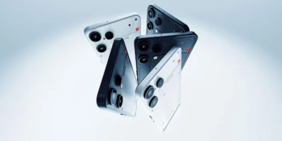
Nothing has made of minimalism and the transparency its visual hallmark. From its first product, the ear (1) From 2021 to its most recent smartphones, the company has maintained a consistent aesthetic: simple lines, an absence of superfluous ornamentation, a monochromatic palette, and translucent materials. This consistency is not accidental, but rather a reflection of a deliberate design philosophy. In fact, design commentators point out that Nothing “adopted a refreshing design philosophy focused on transparency, minimalism, and a fluid user experience.” In other words, the brand aims for “less is more”Each visual element should have a clear purpose and facilitate easy interaction.

It's not just about making beautiful products, but about conveying an identity. The company itself has incorporated touches of technological nostalgia In its minimalist style: for example, the recurring use of dot-matrix fonts (inspired by 1980s computers) and grayscale interfaces. Even before launching its first phone, Nothing generated buzz by showcasing its pixelated logo and retro-futuristic branding materials.
This careful construction of the image — talking about “nothing” long before having anything to sell — made it clear that Nothing's vision went beyond a passing trend. In fact, its founders claim to want “making technology fun again” eliminating complexity and focusing on more intuitive human interactions.
Consequently, the commitment to minimalism is not merely decorative, but reflects an attempt to simplify the technological experience and connect with the nostalgia of times when gadgets were simpler.
However, along with the praise, skepticism also arose. Some observers initially saw the lights Glyph and transparency as a striking trick – comparing them to the RGB lights on mobile phones gaming —and they wondered if this new feature would have any real use or was just another marketing gimmick. Even early reviews were divided: while BBC Science Focus The headline stated that the Phone (1) was “more than a gimmick” alluding to its unique features, while other media outlets opined that, initially, the Glyph interface was indeed basically an ingenious but dispensable embellishment.

Nothing itself seemed to take note of these doubts and, over time, has sought demonstrate with facts Its minimalist aesthetic serves a functional purpose (we'll see this later when discussing product innovation). In any case, the strong visual character of its devices quickly became a topic of conversation, for better or for worse, placing Nothing in the spotlight.
Influence on public perception and media hype
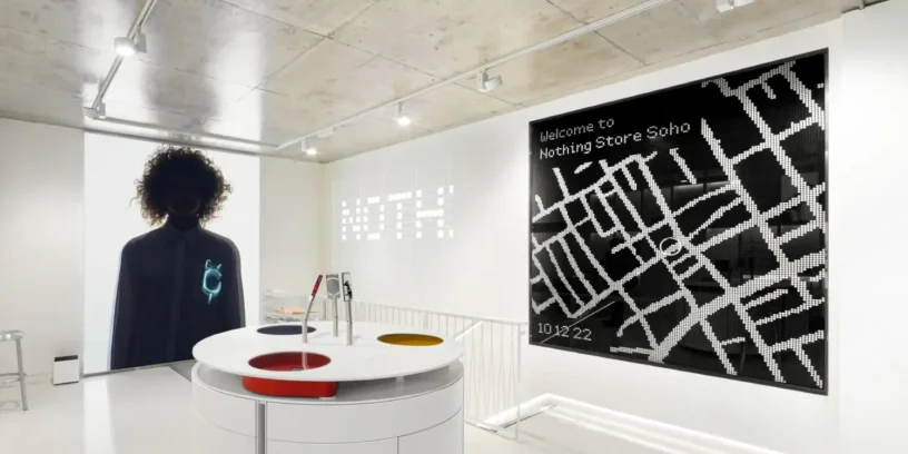
From the outset, Nothing's visual appeal attracted the attention of both the public and the specialized press. In a smartphone market dominated by almost indistinguishable designs, the originality Nothing acted as a magnet for curiosity. Before the release of Nothing Phone (1) In July 2022, the brand deployed a strategy of teasing Showcasing design elements (like exposed screws or the LED pattern) that ignited social media. Without large traditional campaigns, they achieved something valuable: generating buzz among users and the media themselves. organic hype, discussing “have you seen that transparent mobile phone with little lights?”.
When the Nothing Phone (1) finally arrived on the market, first impressions confirmed that it was “a different phone in a sea of monotonous devices”, whose aesthetic sparked curiosity and conversation
That conversation was crucial in building a kind of cult following. Many tech enthusiasts, tired of the lack of visual innovation from major brands, welcomed Nothing almost as a breath of fresh air. Experts highlighted how, upon seeing someone using a Phone (1) in public, it was inevitable to wonder, “What device is that?” – a buzz that turns every owner into an unwitting promoter.
In the words of one analyst, “At first glance, someone unfamiliar with Nothing will be intrigued by such a phone and will want to investigate further… That curiosity can turn prospects into buyers.”In other words, the design has also functioned as viral marketing strategy, generating word of mouth.
Media coverage reflected this interest. Publications from CNET until Wired They echoed the Nothing phenomenon, sometimes with a certain sensationalism (“the startup "Who wants to bring fun back to mobile phones," the press said. A headline from Yahoo Finance He even went so far as to proclaim Nothing as “"The challenging brand that's taking on Apple with a $350 smartphone that could cure your mobile phone addiction"”, alluding to the promise of a less absorbing experience.
Beyond the headlines, many media outlets acknowledged that Nothing had indeed achieved what new brands so desperately sought: differentiate Clearly. Some even compared the commotion to that of the first iPhones in 2007, although the situations weren't quite the same. While some of the initial excitement can be attributed to the figure of Carl Pei (well known in the tech community for his previous success with OnePlus), it is clear that the minimalist and futuristic aesthetic was the element that captured the collective imagination.
The numbers back up this impact. In its first year with the product on the market (2022), Nothing sold around 750,000 units Combining Phone (1) and Ear (1), it generated $1.44 billion in revenue. These were remarkable figures for a fledgling company competing against giants, and they reflect that many consumers were willing to give "that different mobile phone" everyone was talking about a chance. Likewise, the qualitative assessment was mostly positive: professional reviews praised the build quality (construction quality) and the software elegance and interface, highlighting that the Phone (1) offered a smooth and clean experience despite its mid-range price.
Of course, there were also criticisms pointing out shortcomings in camera capabilities or power, but curiously not in the design department: there, Nothing almost always received praise for its boldness and visual innovation. In short, Nothing's minimalist aesthetic did not go unnoticed, influencing public perception by positioning the brand as “the one who breaks the mold” on smartphones, and gaining a level of media attention unusual for a newcomer.
Market positioning and differentiation from other brands
The effect that the Nothing aesthetic has had on his market positioning It's profound. The company set out to enter the mid-range phone market by offering something the competition wasn't: aspirational design at an affordable price. Carl Pei leveraged his experience at OnePlus (a brand that triumphed with affordable "flagship killers") and went a step further with Nothing, combining high-end features in design and experience, but maintaining mid-range prices.

Thus, the Nothing Phone (1) was priced at around €400 – a range where competent but generic devices abound – and quickly stood out for its cutting-edge design. This strategy aimed to attract a specific audience. young professional and enthusiastic, That upper-middle-class buyer who values aesthetics and innovation but doesn't want to (or can't) pay the €1000 for a latest-generation iPhone.
Differentiation has been key. In such a saturated sector, Nothing understood that to survive it had to offer something unique. And that “something” was clearly the design. According to a business strategy analysis, Nothing applied a tactic of differentiation marketing, In other words, he highlighted what makes his product unique to set it apart from the competition. Carl Pei himself didn't hesitate to encourage comparisons with Apple in interviews and presentations, knowing that it was advantageous to be mentioned in the same breath as the Cupertino giant to enhance his brand's image.
In a way, Nothing positioned itself as the “indie Apple”: meticulous attention to detail, consistent design across its entire ecosystem (phone + headphones + software), and a carefully crafted brand narrative, but with a more open approach (it uses Android) and a more rebellious tone. Experts have pointed out clear parallels, for example: “The design philosophy of the Phone (1) prioritizes aesthetics and functionality, echoing Apple’s focus on design over specifications”Also, like Apple, Nothing emphasizes the comprehensive experience above the raw specifications sheet, something that contrasts with many Android brands that compete mainly on numbers (more megapixels, more RAM, etc.).
Another aspect of Nothing's positioning is its image of disruptive brand and close to the community. While Apple represents the established and premium, Nothing presented itself as the outsider A fresh approach that challenges the status quo of the mobile industry. Its informal communication (like those mocking tweets from Carl Pei) and the building of a highly engaged fan community have given it a unique feel. startup which generates sympathy among enthusiasts. All of this reinforces the differentiation from other more traditional companies. For example, Samsung or Xiaomi, despite having excellent devices, have not managed to create that sense of tribe around a design ideal as Nothing has done.

In the eyes of the consumer, Nothing occupies a peculiar niche: products with a futuristic concept look, But they are real and usable, backed by a small company with big ambitions. This mix has been enough for many to see it as “the new competitor to watch”. In short, minimalist design not only defines Nothing's aesthetic, but is the central pillar of its strategic positioning: what makes it different and attractive in a sea of options.
Design philosophy: from visual appearance to user experience
A crucial question is whether Nothing's minimalist aesthetic remains superficial or truly permeates the user experience and the philosophy behind its products. Evidence suggests that, to a large extent, it is the latter. The company has insisted that its design approach seeks resolving common frustrations Everyday technology isn't just about looking good in your hand. Several examples on their devices tangibly support this idea.
In the case of the Ear headphones (1), Its transparent design was not only eye-catching but functional: the charging case incorporated a circular depression (dimple) on the lid to make it easier to remove from your pocket and improve grip. The reason? To prevent accidental drops and the typical problem of cases slipping. This small, aesthetically subtle design detail solved a practical problem identified by users (the founders themselves said that many earbuds (They get damaged by silly falls). Here we see how Nothing's minimalist philosophy includes the premise that Each element must have a purpose.. Similarly, the transparency of the case allows you to check at a glance whether the earbuds are in place and charged, which is both useful and interesting. This type of solution demonstrates a mindset of functional industrial design, beyond the decorative aspect.

On phones, the use of lights Glyph The back has evolved to offer utility. While initially they might have seemed purely retro (reminiscent of the blinking lights on an old landline phone or the indicators on vintage devices), Nothing has integrated them with smart notification functions. For example, in the Phone (2) These LED strips can be used to show the progression of a timer or the volume level when adjusting it, and can even allow you to assign light patterns to important contacts to recognize priority calls or messages without looking at the screen.
Personally, I love to prop my phone up face down and Ignore the screen until a light turns on, visually indicating that someone important has written to them. In this way, Nothing proposes a use of the telephone less intrusiveInstead of constantly lighting up screens or loud sounds, a subtle light alert informs the user. This ties in with the idea of combating "smartphone addiction" or at least reducing distraction, by providing “human warmth” to technology, as Carl Pei said. A report highlighted precisely that the brand's objective was “to bring back some human warmth to their products” in contrast to cold and generic devices.
In short, what could be seen as an ornament fashion, Nothing aims to have an impact on daily interaction, making the experience more calm and focused on the essentials.
The minimalist philosophy is also reflected in the software. Nothing OS, The Android layer used by their phones is visually extremely clean: monochromatic icons, neutral backgrounds, minimal animations. Nothing's design language makes the interface look pleasing and feel distinctive. widgets Elegant minimalism. This serves not only an aesthetic but also a functional purpose: limiting the use of colors and elements aims to prevent the user from being overwhelmed and to allow them to... focus on essential information. It provides you with essential information on the first screen and then invites you to look out at the world beyond.”, emphasizing that if one joins “"The game of technological minimalism needs nothing more"”.
In other words, Nothing's interface is designed not to unnecessarily hold the user's attention, unlike others that try to hook them with constant notifications, flashy icons, or endless feeds. In a way, it's a almost philosophical visionTechnology should serve a purpose, and then... move away, instead of dominating the user's life.

Of course, some will argue that at the end of the day, a Nothing Phone is just another Android smartphone and that these design subtleties don't radically change its core functionality. But they do provide a distinct user experience: many owners report that they simply enjoy the sensation The device is appealing to many, whether for its physical aesthetics (which are "a pleasure to show off to friends") or for its beautiful, clutter-free interface. It's no coincidence that Nothing won one of the awards in 2023. iF Design Award Thanks to a phone co-created with its community, valued for its innovative design. All this indicates that Nothing's minimalist aesthetic acts as common thread from the visual aspect to the interaction design, permeating the company's product philosophy.
Impact on the industry and influenced brands
Nothing's emergence with its distinctive visual style has also resonated within the tech industry and among other brands. Historically, successful design trends tend to be adopted (or imitated) by the competition, and Nothing is already beginning to see the effects of its influence. A very clear example occurred in 2023, when the manufacturer Tecno announced a smartphone with LED strips on the back very similar to Nothing's Glyph. The similarity was so striking that Nothing publicly called them out on social media, jokingly adding a “If you’re going to copy our homework, at least ask for permission next time.”. Media outlets reported how Several manufacturers began to "be inspired" by Nothing's visual language, especially in the lighting system and the transparent panel.
Infinix, another emerging brand, also launched a model with a translucent casing and backlighting, confirming that Nothing had made a certain trend fashionable. retro cyber aesthetic. The fact that Chinese competitors are quickly incorporating similar designs suggests that Nothing struck a chord with the public – they saw there was an appetite for devices with visual personality – and now others are looking to capitalize on that trend. While imitation is a double-edged sword (on the one hand it validates that your idea was good, on the other it reduces your exclusivity), in this case it has served to to consolidate Nothing as a design benchmark in the industry; after all, everyone recognizes where the original inspiration came from.


It's not just mobile phone manufacturers who have been influenced. Nothing's aesthetic, with its blend of modern minimalism and nostalgic touches, has resonated throughout the wider industrial design community. The renowned publication Yanko Design He highlighted that Nothing and its flagship products have become a "great source of inspiration" for designers, thanks to that fusion of a distinctive aesthetic with innovative functionalityIn fact, Yanko even compiled fan-created imaginary product concepts that adopt Nothing's visual style: from cameras to electric bicycles with transparent casings and discreet LEDs.
This shows that the brand has succeeded establish a recognizable style, That's no small feat in such a short time. We could compare it to what Apple did back then: many gadgets from the late 2000s tried to imitate the elegant minimalism of the iPod/iPhone. While the scale is different, Nothing has ignited a similar spark of style to follow in this decade.
In summary, the impact of Nothing is already being felt in competitor products that adopt elements of their aesthetic, in the inspiration it provides to designers and in the conversation about the importance of design in the value proposition. For such a young company, achieving this impact on the industry means that its visual approach wasn't just a temporary eccentricity, but rather an indication of a latent demand for design innovation. Now, it remains to be seen whether this influence will endure and grow (will we see more transparent phones in the near future?), or whether the market will quickly become saturated with imitations and move on to the next fad. For now, Nothing can say that it has forced more than one to get your act together in the design section.

Marketing, community and loyalty: beyond aesthetics
Another important angle is how Nothing's minimalist aesthetic has influenced his marketing strategy and in building a community of loyal users. Here, form and substance intertwine: the brand image has been so powerful that in a way has advertised alone to the company, but behind that image there is also a conscious effort to engage the public and create a sense of belonging.
From the outset, Nothing opted for unconventional marketing, heavily reliant on social media and the public figure of Carl Pei. Distinctive design was central: on Instagram, Twitter, and YouTube, the company shared carefully curated photographs of its products, showcasing aesthetic details, almost as if selling modern art objects. consistent branding (Same typography, same neutral tones, short and enigmatic messages) quickly built a recognizable brand personality. With such a distinctive style, every post, every introductory video, reinforced the same idea in the consumer's mind: Nothing = cool and futuristic minimalism.
An interesting case was the launch of the Phone (1) through an invitation campaign and initial limited units, which generated a sense of exclusivity similar to what OnePlus did in its early days. The difference is that here the hook wasn't "the most powerful phone for less money" but "the phone that it looks "Different from everyone else." And it worked. As one study pointed out, Actively engaging followers on social media helps build a loyal community of brand advocates, something that Nothing has achieved in spades.
Aesthetics also played a role in the customer loyalty by creating a sense of belonging. Many Nothing buyers feel part of a special club, one that values the design and philosophy behind the product. It's common to see users on forums and social media proudly showing off their Phone (1) or (2), highlighting details of the interface or the lighting—in other words, becoming spontaneous ambassadors.
Nothing enhanced this by giving a voice to its community: it conducted surveys on features, opened a very active official forum (Nothing.communityand even released special editions co-created with fans. A notable example was the Community Edition The Phone (2a) Plus, a limited edition device (only 1000 units) whose customizations – from the engraving on the frame to exclusive wallpapers and packaging – were designed together with members of the community.

These types of initiatives generate a huge emotional commitment; the message is “this brand takes us into account, is ours”Thanks to actions like these, Nothing has cultivated a very loyal fanbase for its size in just a few years. An analysis of its trajectory highlights that its Transparent communication, a consistent brand personality, and a genuine commitment to the community have earned them a loyal audience., achieving “to capture the imagination of consumers worldwide”.
There's no doubt that Carl Pei, as the public face of the brand, has been instrumental in this customer loyalty strategy: he maintains a close presence on Twitter, engages with users, and even jokes publicly with competitors, all of which humanizes the brand. Nothing's "formal yet approachable" tone in its communications—similar to the one requested for this article—has successfully balanced professionalism with warmth, aligning with its philosophy of giving back. warmth to technology. Technology and design enthusiasts, Nothing's target audience, appreciate that accessible language and those cultural references (for example, to retro tech oa memes) that the brand uses.
Ultimately, the consequence of all this is fidelitySatisfied customers not only become repeat customers but also bring others (friends, family) into the fold. Thus, the cycle is complete: an attractive aesthetic attracts curious onlookers, a consistent experience and intelligent engagement turn them into fans, and those fans bring in more interested parties. It's a formula that Nothing is successfully executing, demonstrating that its visual approach is not separate from its commercial success, but rather an integral component of it.
Aesthetics with a real purpose
Far from being a fleeting trend or merely a stylistic exercise, Nothing's minimalist aesthetic reveals itself as a genuine brand philosophy with a tangible impact. In terms of image, it has allowed them to stand out in an ultra-competitive sector, capturing public attention and differentiating themselves from much larger rivals. In terms of product, this "less is more" approach has translated into design decisions that improve (or at least positively alter) the user experience, from an interface designed to reduce distractions to hardware details conceived to solve minor everyday inconveniences. And in terms of the market, this philosophy has cemented a strong identity that inspires customer loyalty and even prompts other industry players to emulate it.

Of course, the challenge for Nothing will be keeping this value proposition alive in the long term. Visual trends can become stale if they don't evolve; the company will have to balance consistency with freshness so that its minimalism doesn't become monotonous. Likewise, it will have to demonstrate with future products that there is still substance behind the look—that is, that it can innovate functionally and not just aesthetically. However, after analyzing its trajectory over these years, everything suggests that Nothing understands the difference between designing to look good and design to be better.
Its minimalist aesthetic is not an end in itself, but rather a means to express a vision: that of a more human, simple, and fun technology. In that sense, we can conclude that we are dealing with something more than a passing fad. Nothing has made minimalism the core of its brand, And in doing so, it's leaving a real mark on both public perception and trends in the tech industry. If the future of devices will be more transparent, intuitive, and essential, much of it will be thanks to this small company that dared to embrace the aesthetics of "nothingness.".
Leave a Reply