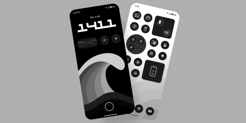
We live bombarded by visual stimuli. Our phones often become sources of noise with dozens of widgets and garish colors. That's why I'm a Nothing user Phone: his design philosophy It's the only one that truly allows you to regain control of the screen. Leveraging the native capabilities of Nothing OS, I have configured my device to be a haven of visual peace: minimalist, clean, elegant and functional.

Today I want to show you in detail How do I have my Nothing Phone configured?, Step by step, in strict grayscale so you don't strain your eyes and can enjoy the interface as it was intended. You'll find all these options on any Nothing or other mobile device. CMF sub-brand.
1. Lock screen: less is more
Let's start with the first thing we see. Let's forget about that personal photo with your partner or your adorable pet that takes up the whole screen. Why? Because the weather display looks bad: the clock widgets and notifications cover it up, creating a visual mess.
The fund
I prefer a minimalist background. In this case, I've chosen a black and white photograph of a wave. This type of background works well whether your screen is full of notifications or empty, as it doesn't cover important elements like people's faces.

Widgets
I've chosen just 3 shortcuts, enough to avoid cluttering things up. They're useful and don't compromise privacy:
- Information on when the sun rises and sets
- Direct access to the timer of the Glyph Matrix
- Shortcut to activate the flashlight
Goodbye to lower access points
I've removed the shortcuts that usually appear by default in the bottom corners of the lock screen. I hardly ever used them, and they're slower: you have to press and hold the icon, which sometimes takes longer than unlocking the phone and opening the app.
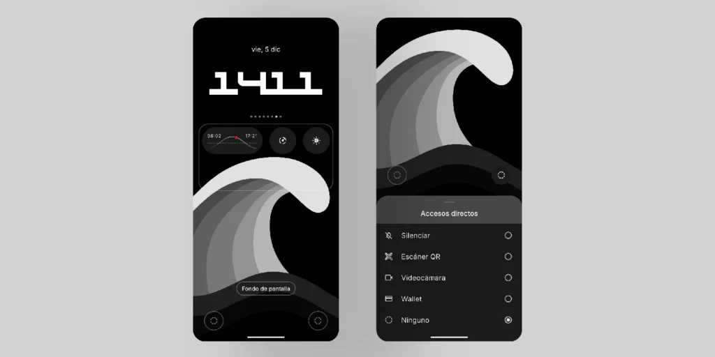
Physical shortcuts
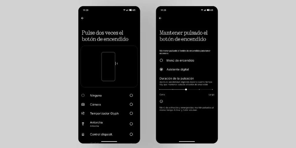
Additionally, to compensate for those access points, I use the power button:
- Double tap: immediate access to the Wallet
- Press and hold: access to Gemini AI (Google)
This gives us a clean lock screen that uses little battery when dark and, although it may sound contradictory, is striking for how neat it looks.
ADVERTISING
2. Home screen: Symphony in grays
Let's go to the Nothing control center. Here I repeat the golden rule: don't put a personal photo as your background, as it will be buried under the icons and widgets.
Background and contrast with the shortcuts/apps
For this setup, I've chosen a wallpaper with a subtle white scale. This contrasts beautifully with the black icons, creating a clean and very elegant look.

By the way, if you've fallen in love with my wallpapers, they can download in a way free in Digital Minimalist. What a genius its creator is!
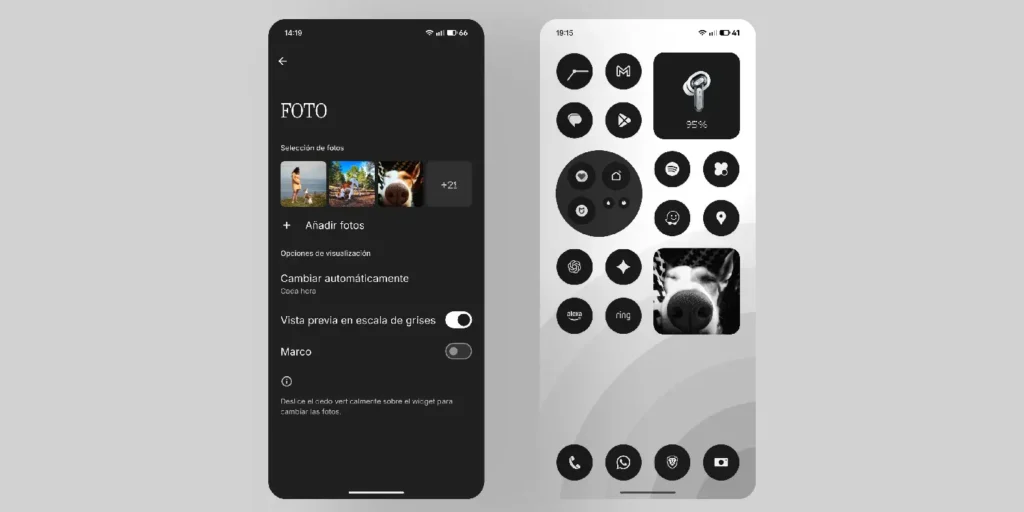
Personal photos
If you want some dynamism without breaking the aesthetic, use the widget Photos of Nothing. Add several photos you like so they change every time you unlock your phone or every few hours. This gives it a personal touch without having the photo partially obscured by icons and widgets as your wallpaper.
- Recommendation: In the widget settings, disable the "frame" option and enable «"grayscale preview"». Thus, the photos blend into the monochromatic environment.
Minimalist icons
How do you achieve this? It's very easy to configure Nothing OS to make everything look this clean:
- Icons without names and in black: Press and hold on the home screen > Personalization > Icon pack > Select Nothing.
- System grayscale: in the same Personalization menu > Colors > Basic Colors > Choose shades of gray.

Arrangement and order
Order is fundamental to minimalism.
- Go to Personalization > Layout.
- Application grid: Select 4. This prevents cluttering the screen with 5 rows of icons and reduces the proportion issues with third-party widgets.
- Deactivate tags: Disable the "App Label" option. This removes the names below the app icons. Essential for a clean look.
- Search bar: Select "No search bar" to remove the Google search bar from the bottom.
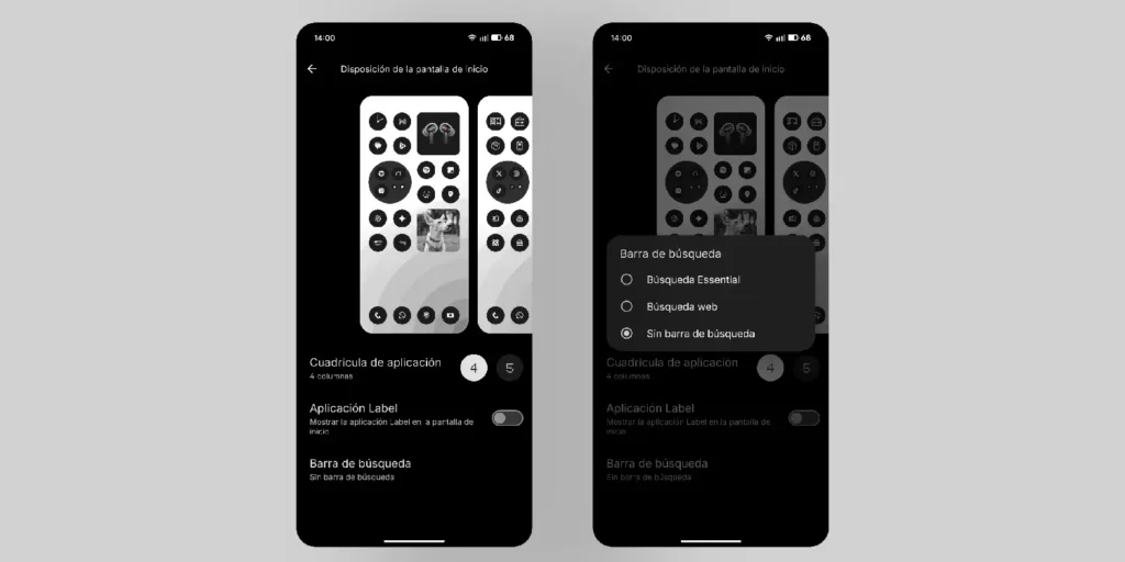
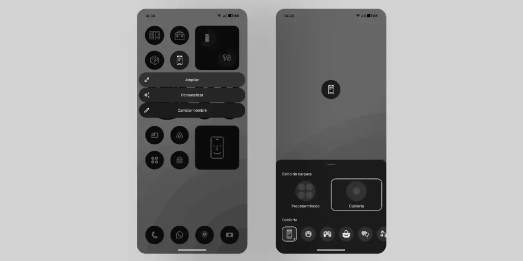
My personal organization: As you will see, my two home pages have exactly the same layout and order of shapes to maintain visual balance.
- I hide secondary applications inside folders.
- To keep the folders from looking out of place, I use a single emoji as a "cover" instead of showing the tiny icons inside.
- I only use two essential widgets: the battery status of my connected devices and screen time to control my "addiction" a little.
3. Quick access: just what's necessary
Everyone should arrange it as they like, but my recommendation for maintaining minimalism is clear: Keep only the ones that fit when you slide down once..
If you have to swipe to the side to see a second page of logins, they cease to be "fast" in my opinion.
- Personal tip: I have a major disorder with visual order, so I change the names of all my Bluetooth devices to be short, fit perfectly in the widget, and not cut off the text.

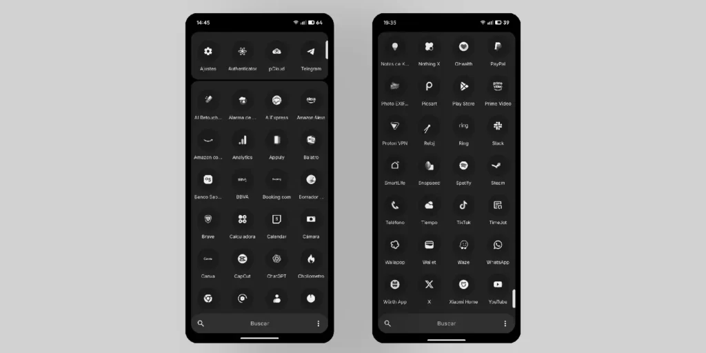
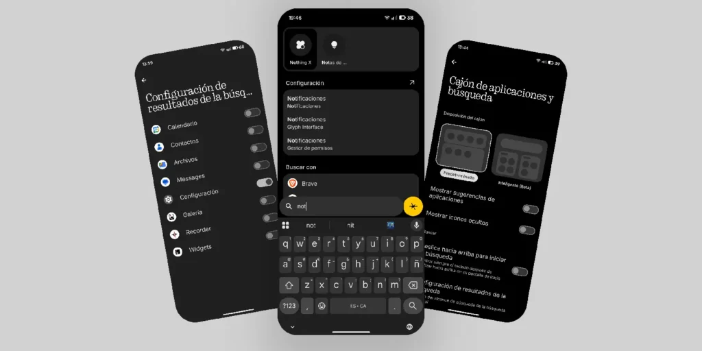
4. Application drawer: hidden organization
The app drawer is where chaos lives, but in Nothing we can control it.
App anchoring
I have four apps pinned to the top so they always stay there. Try to keep the number of pinned apps or rows a multiple of four to avoid disrupting the visual grid. You can continue with this idea of having multiples of four apps in the app drawer so that when you swipe, you always end up with all the apps. Yes, it's masochistic, but I love symmetry.
Drawer configuration
If we click on the three dots in the upper right corner of the drawer, we access important options:
- Avoid "Smart (Beta)" mode: It organizes everything automatically and doesn't allow any modifications. It's a shame; manual control is much better.
- Hidden icons: I recommend deactivate «"Show hidden icons." If you hide apps you don't use often (for example, those you only access via the "share" button in other apps), you don't want an unsightly "Hidden" icon appearing at the bottom of the app drawer. Disabling this makes it disappear, keeping the interface clean. If you need to access an app again, simply re-enable the option temporarily.
- Privacy in search: In "Search results settings", my recommendation is Disable EVERYTHING except "Settings"«. If you have enabled search in contacts, photos, calendar, or SMS, your privacy is highly vulnerable if someone looks at your phone while you're searching for a simple setting or app.
5. Dark mode and final details
To complete the Nothing aesthetic, the treatment of light is vital.
Deep dark
- Go to Settings > Display and turn on the Dark theme.
- Extra tip: They've now added an extra option. If you tap on the text "Dark Theme," it takes you to another screen where you can activate it. «"Extra Dark Mode"». This makes the blacks deeper. For now, it's limited to menus and apps in Nothing, but further integration is expected.

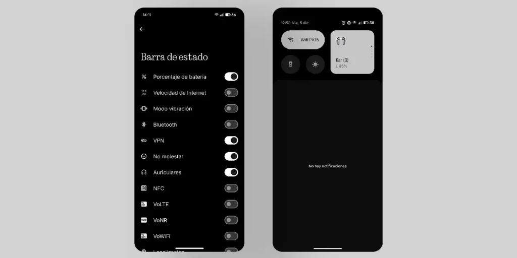
Status bar
Finally, we go back to Settings > Display > Status bar. There you can configure which icons you want to appear in the top right corner. I recommend keeping only the essential ones. This will prevent an excess of icons crammed into the corner.
What did you think of this configuration?
This is where my journey through the depths of my Nothing Phone (3). It may seem like a radical change to give up the usual colors and saturation, but I assure you that the visual tranquility you gain is worth it.
Now I'd like to hear from you. Are you up for trying this grayscale setup, or do you prefer colorful chaos? And most importantly: Do you have any organization tricks or secret widgets that fit this aesthetic and that you'd like to share with me? We listen but we don't judge your OCD!
Let me know in the comments; I'm always looking for new ways to further refine the experience. Enjoy the simplicity!
Leave a Reply