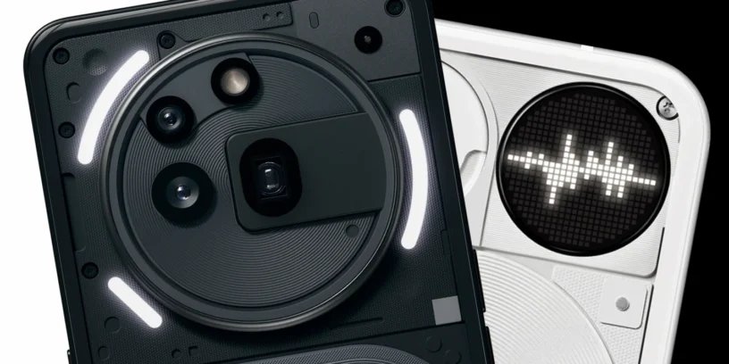

Nothing has stirred up a hornet's nest again with the Nothing Phone (3). This time, the iconic LED strips give way to a tiny screen of dots christened as Glyph Matrix, This change has divided the community: some see it as a betrayal of the brand's visual identity, while others celebrate the functional leap as something natural.
Strengths of the glyphs
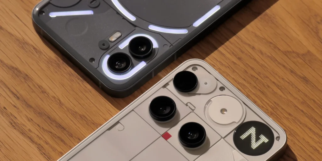
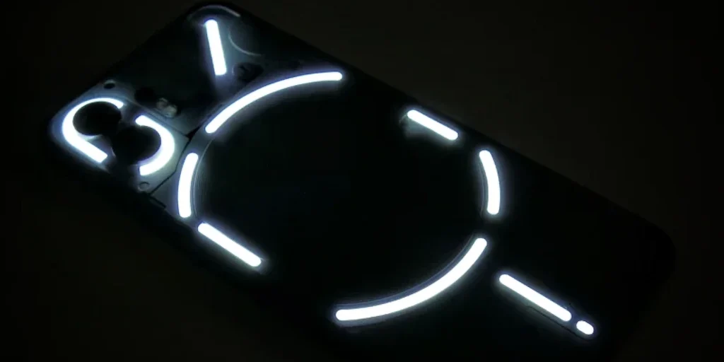
The Phone (1) and (2) and the (2a) and (3a) series integrate independent LED zones to illuminate your phone when receiving calls, notifications, or to set timers, among other uses. Therefore, from my point of view, glyphs offer the following advantages:
- Elegant and recognizable design which stands out with its transparent back
- Very eye-catching Turning the phone over on a table: it's pure "wow" effect«
- High visibility even in well-lit places, at a distance, or in peripheral vision
Limitations of the classical glyph system
- Very basic informationIn practice, you just know there's something important... but we have to turn the phone around to find out exactly what it is.
- Functional stagnationAfter two generations, it seems that it no longer has much more to offer creatively.
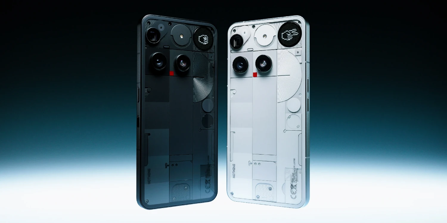
The arrival of Glyph Matrix
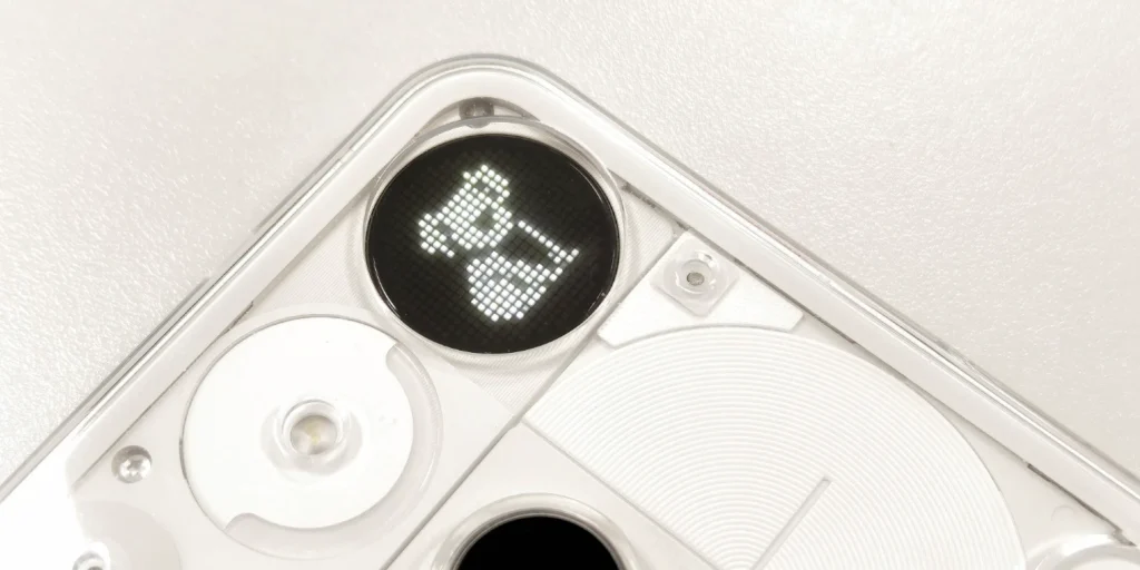
Nothing presents the Glyph Matrix as the new visual heart of the device. It is a dot matrix display capable of displaying notifications in more detail, dynamic visual alerts, and even small games and widgets.
Clear advantages of the Glyph Matrix
- More useful information without having to turn the phone around: contacts, timers, notifications, alerts…
- Almost infinite potential thanks to the Open to developers: mini widgets, games, tools…
- Less invasive In the dark, ideal for environments where you don't want to disturb with bright flashes
- Coherent evolution which continues to focus on rear interaction, but in a more flexible way
Their current weaknesses
- Small size which may fall short in visual spectacle
- Very few features at launchBeyond notifications, it's almost purely decorative. The current glyph toys look like tech demos. We've even (for now) lost glyph features that could be perfectly integrated into this device, such as reacting to the music playing on your phone or showing you how long until your Uber arrives.
- Less visible from a distance or in side vision, It loses impact compared to LED strips.
- For some fans, it means a loss of personality, by moving away from the design that made Nothing famous
Personal opinion: nostalgia yes, but with an eye to the future
Although I admit I miss the classic Glyphs for their unique aesthetic and science fiction feel, I think this transition is necessary and intelligent. The Glyph Matrix is still in its infancy, but its potential is enormous. Now it's up to Nothing (and its community) to turn it into a useful and versatile tool.

Today it's little more than a curious ornament. Tomorrow, who knows… perhaps we'll be talking to a mini visual assistant inside that screen, with the phone turned around, as if a tiny digital being lived inside. Not far-fetched when you think about what it could bring. Nothing OS 4.0.
The Glyphs were a visual revolution. Glyph Matrix can be a functional revolution. And if Nothing plays its cards right, both paths could end up being equally iconic.
Leave a Reply