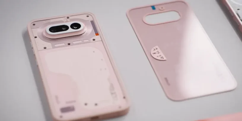

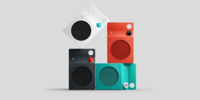
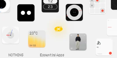
Behind every technological device lie hundreds of hours of programming, component engineering, and durability testing. However, there is a phase of the process that often goes unnoticed by the general public, but which completely determines the first impression a product makes when we take it out of the box: the department of CMF: Color, Material and Finish.
If you're a Nothing fan, you'll know that the sub-brand exists. CMF of Nothing (which now works independently) that has the name of the acronym of this department, but this time I will be talking about the CMF department, not the CMF brand!
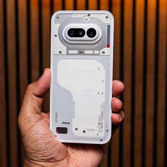
Through a recent post in your community, Nothing wanted to give a voice to Lucy and Esmé, the women in charge of this division at the London-based firm. Their work doesn't simply consist of "choosing a color from a palette," but of designing a complete sensory strategy that defines the brand's identity. From the cool touch of the aluminum in the new Phone (4a) Pro even the iconic transparency of Phone (1), Every detail is meticulously calculated.
London as the epicenter of inspiration
For the CMF team, the creative process for any device begins long before the hardware is defined. As Esmé explains, the starting point lies in analyzing the global trends on social media, the world of fashion, and contemporary art exhibitions. In this sense, having her studio in the central London This gives them a huge competitive advantage, as they are at the epicenter of urban culture and cutting-edge design.
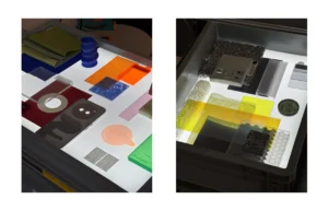

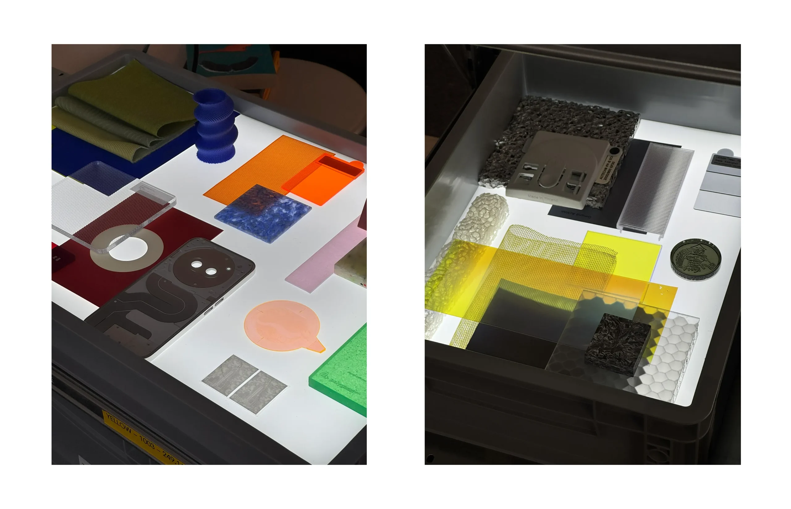
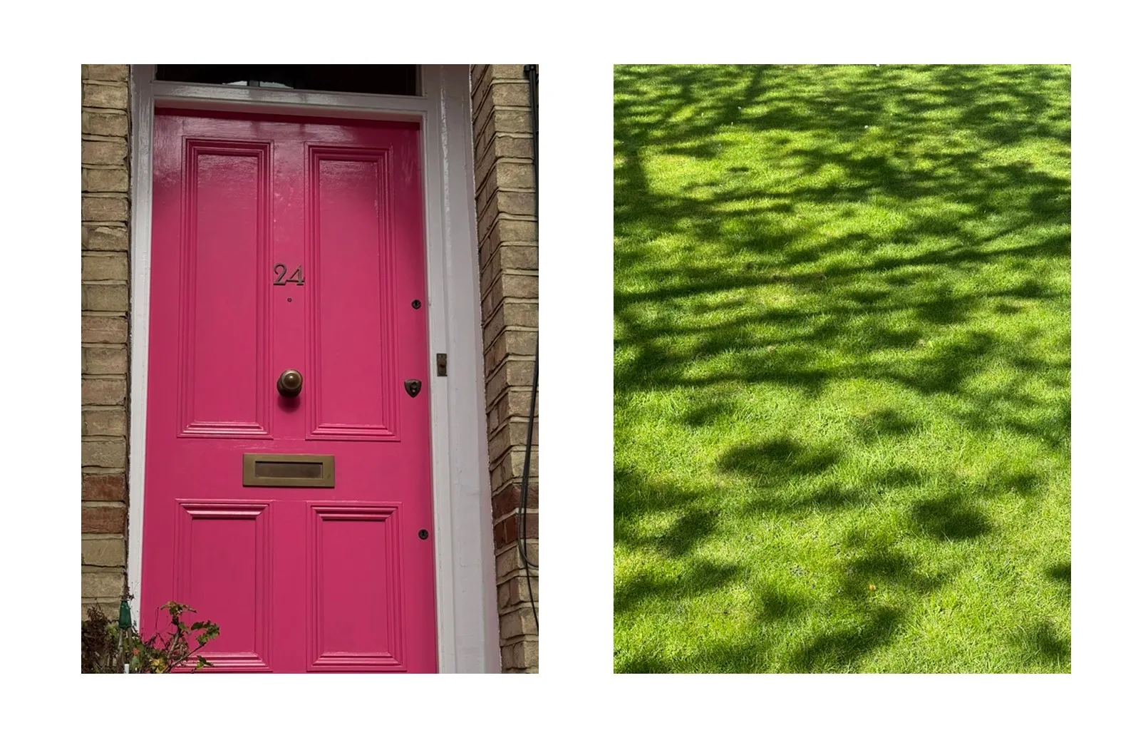
From there, the work is divided between digital research and physical experimentation. The team uses visualization tools like Photoshop or Keyshot, but the real challenge comes in translating those concepts to their own project. internal materials library. This library is a living ecosystem composed of plastics, biopolymers, metals, textiles, and coatings of all kinds. For example, for the development of the Ear (open) in its blue tone, The team confesses to having delved into digital archives and classic design magazines until they found the exact shade that conveyed freshness without losing elegance.
ADVERTISING
The psychology of color and product scale
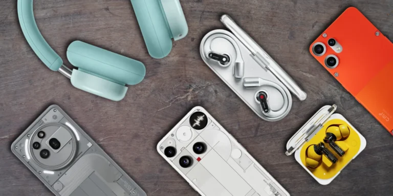
One of the most interesting aspects of Nothing's strategy is how they adapt the color according to the product type and size. The paler and softer tones They are reserved for larger devices, such as the Headphones (a), with the aim of evoking lightness, ergonomics, and comfort. Conversely, the deeper and more saturated colors They are used in smaller elements, such as the Ear (a), to convey a sense of durability, strength, and technical functionality.
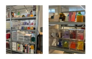
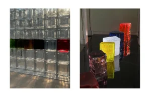
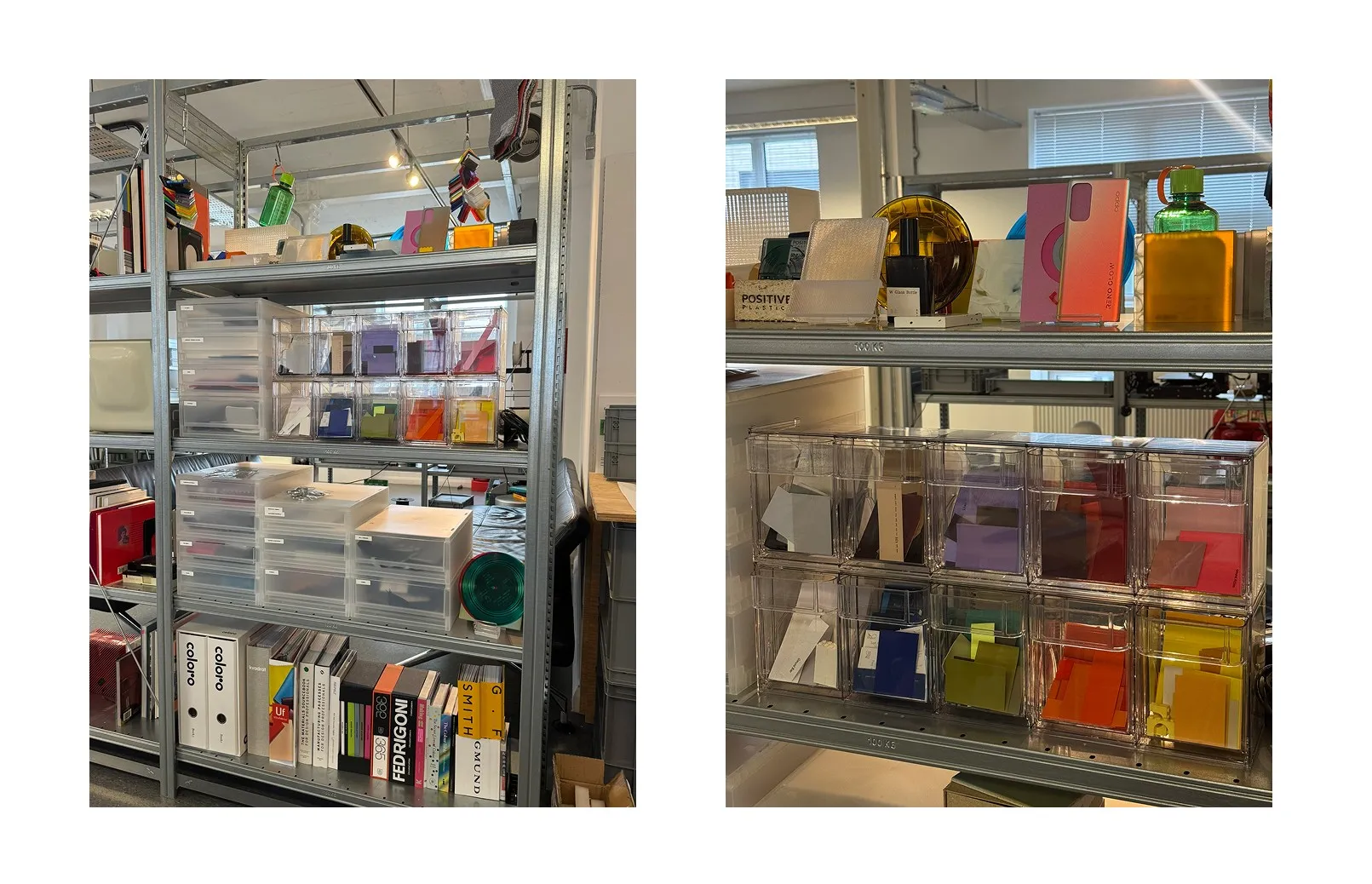
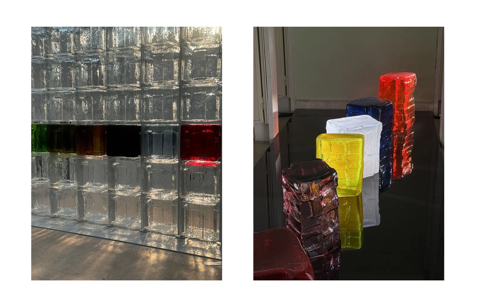
The obsession with detail is such that, for every visible part of a device, dozens of samples are evaluated. In a conventional smartphone, the CMF team must specify the finishes of some 20 different parts; in complex audio products such as Headphone (1), That figure exceeds 40 separate pieces. The ultimate goal is to find the perfect balance between aspirational and professional, always avoiding tones that could make a premium product look like a toy.
ADVERTISING
The brand's aesthetic future
The dedication that Lucy and Esmé put into textures and nuances demonstrates that technology can and should be an object of artistic expression. Furthermore, the article leaves us wanting more: Esmé has already hinted that she is particularly obsessed with a new secret color which will be part of a release scheduled for later this year. We'll have to keep a close eye on it.



Leave a Reply