
Have you seen Realme's new semi-transparent Neo 7 Turbo phone? It probably reminded you of Nothing, right? And the question is obvious: Is it a blatant copy or a legitimate inspiration?
Nothing made transparency fashionable with its phones and headphones, and now it seems everyone wants a piece of the pie. Let's delve into this topic to understand if Nothing, in turn, was inspired by something earlier and if they are now being copied. Is this simple imitation, a clever marketing strategy, or a sign that design trends always come back around?
Did Nothing Copy First? A Journey to the Transparent Past
To be fair, Nothing didn't invent transparency. This concept has a long and cyclical history in the world of electronics. Long before the brand appeared, we were already seeing transparent devices.
In 1939, for example, there was already an RCA television with a Plexiglas casing, designed to demonstrate to people that there were no tricks. In the 80s and 90s, we experienced a real craze for transparent landline phones, and in 1998 Apple revolutionized design with the iconic iMac G3.
Game Boy Color "Atomic Purple", transparent Nintendo 64 controllers, even a Sony Ericsson with a transparent screen in 2009…The list goes on. Nothing didn't invent the idea, but they did manage to bring it back with a fresh and coherent feel.
Nothing's own design director, Adam Bates, has acknowledged that there is a touch of retrofuturism In its aesthetics, with clear nods to those 90s Apple products. Nothing new under the sun, but with a modern and elegant execution.
The magic of Nothing: transparency with purpose
Nothing's arrival on the market was no coincidence. Carl Pei, Its founder had a clear mission: to give technology its soul. He wanted to break with the impersonal nature of the industry and return it art, passion and confidence.
Transparency, for them, It's not a visual trick., but a design philosophy. "Bringing the inner self to the outside," showing what is normally hidden. A statement of principles that began with headphones. Ear (1) and it was consolidated with the Phone (1).
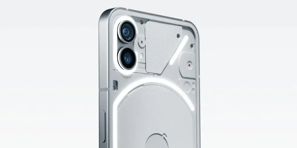
But the real differentiator is the Glyph Interface. That network of small LEDs on the back of the phone. It's not there just for aesthetics.They answer calls, notifications, indicate battery level, serve as a light for taking photos… They integrate design with functionality. And that's not something you see every day.
To achieve this, Nothing had to rethink the arrangement of its internal components, Reviewing manufacturing processes and even drawing inspiration from the 1972 New York subway map. A transparency designed down to the millimeter.

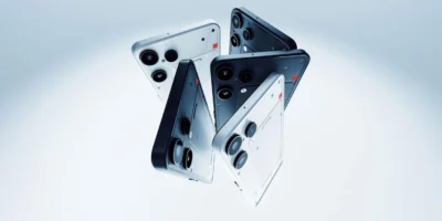
Realme and the new wave: inspiration or decorative mirror?
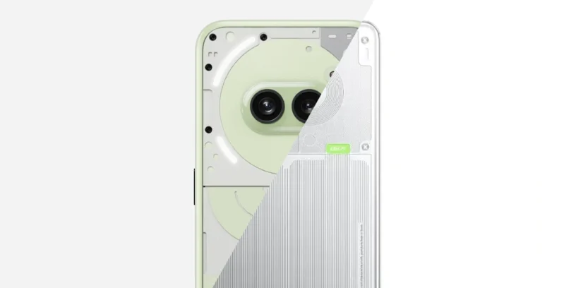
Let's go back to Realme. With its Neo 7 Turbo, they've opted for a rear design that It mimics the internal components, And they've said it clearly: they were inspired by Nothing. The visual similarities are there. But there's a key difference: There is no Glyph Interface, no interaction, and no apparent internal redesign.. It's a decorative case, a look. Which isn't bad, but It remains superficial..
More than plagiarism, Realme seems to be acting like a manufacturer that It follows an emerging trend to connect with an audience that has already shown interest in that aesthetic. A commercial move, like so many in the industry.
The domino effect: transparency is making a strong comeback
The success of Nothing has revived interest in transparent devices. We're seeing it in headphones, game controllers, and other accessories.
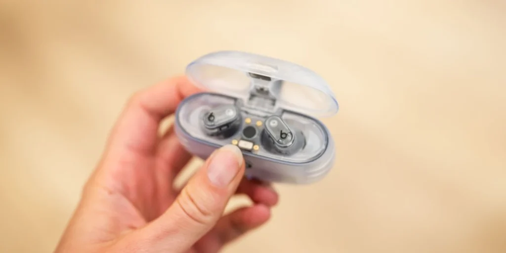
There's a mixture of nostalgia and longing for «"see the inner magic"». The appeal of transparency isn't just visual: it creates an emotional connection with the object. It allows us to appreciate its engineering, giving us a sense of control and authenticity. Think of Beats Studio Buds with translucent cases, the new Xbox controllers… It's not a coincidence. The market responds when it sees that something works and excites.
Transparency with a purpose or simply an aesthetic trend
After all this review, it is clear that transparency is an idea with a history, one that comes and goes, but that Only a few brands truly manage to make it their own.
Nothing didn't invent aesthetics, but it has certainly transformed it. a distinctive and functional visual language. It's not just a phone that looks good on the outside: it's consistent on the inside. Transparency isn't just for show., but to provide value and experience to the user.
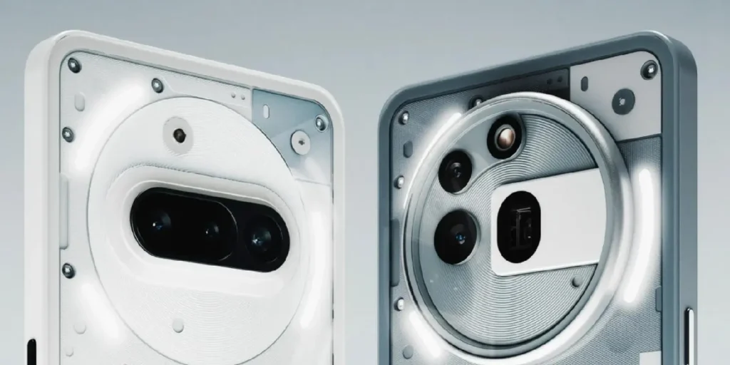
Realme, for its part, has captured a striking aesthetic and applied it more superficially. There's no functional innovation, but there is a clear intention to attract attention. This is perfectly valid in the world of marketing, but far removed from what Nothing has built.
The key question is this: is it just a pretty design, or is there a story, engineering, and utility behind it? In Nothing, everything is part of the concept. And that, in a saturated market, continues to make a difference.

2 Pingbacks